garden of eden
BRAND GUIDELINE
Over 15 years ago, Garden of Eden opened its doors for the first time to the residents of Alameda County. What started out as a refuge for community members seeking responsibly sourced medical cannabis in the quasi-legal market of its time, has strengthened its roots and weathered the storms, to become one of the Bay Area’s oldest retail dispensaries. Now fully licensed and open for recreational sales, Garden of Eden offers a curated selection of a variety of cannabis products, choosing quality over quantity for our customers since 2003. That same quality first approach has won Garden of Eden the award for Best Flower Selection in the East Bay Area, further solidifying our commitment to become a pillar in the community for clean, high quality cannabis products.
Brand Mark


Brand Mark Usage


Brand Mark - Partnership Vertical Lockup


Brand Mark - Partnership Horizontal Lockup


Color Theory
Main Grey
HEX: 6C6E70
CMYK: 0, 0, 0, 70
RGB: 76, 76, 76
Pantone: Cool Grey 10 C
Accent Red
HEX: ED1C24
CMYK: 0, 88, 85, 7
RGB: 237, 28, 36
Pantone: Solid Coated 185
Secondary Grey
HEX: AEADAE
CMYK: 0, 1, 0, 32
RGB: 174, 173, 174
Pantone: Solid Coated Cool Gray 5 C
Background
HEX: FFFFFF
CMYK: 0, 0, 0, 0
RGB: 255, 255, 255
Pantone: Solid Coated White
Typography

Headline Typeface

Body Copy Typeface
Photography
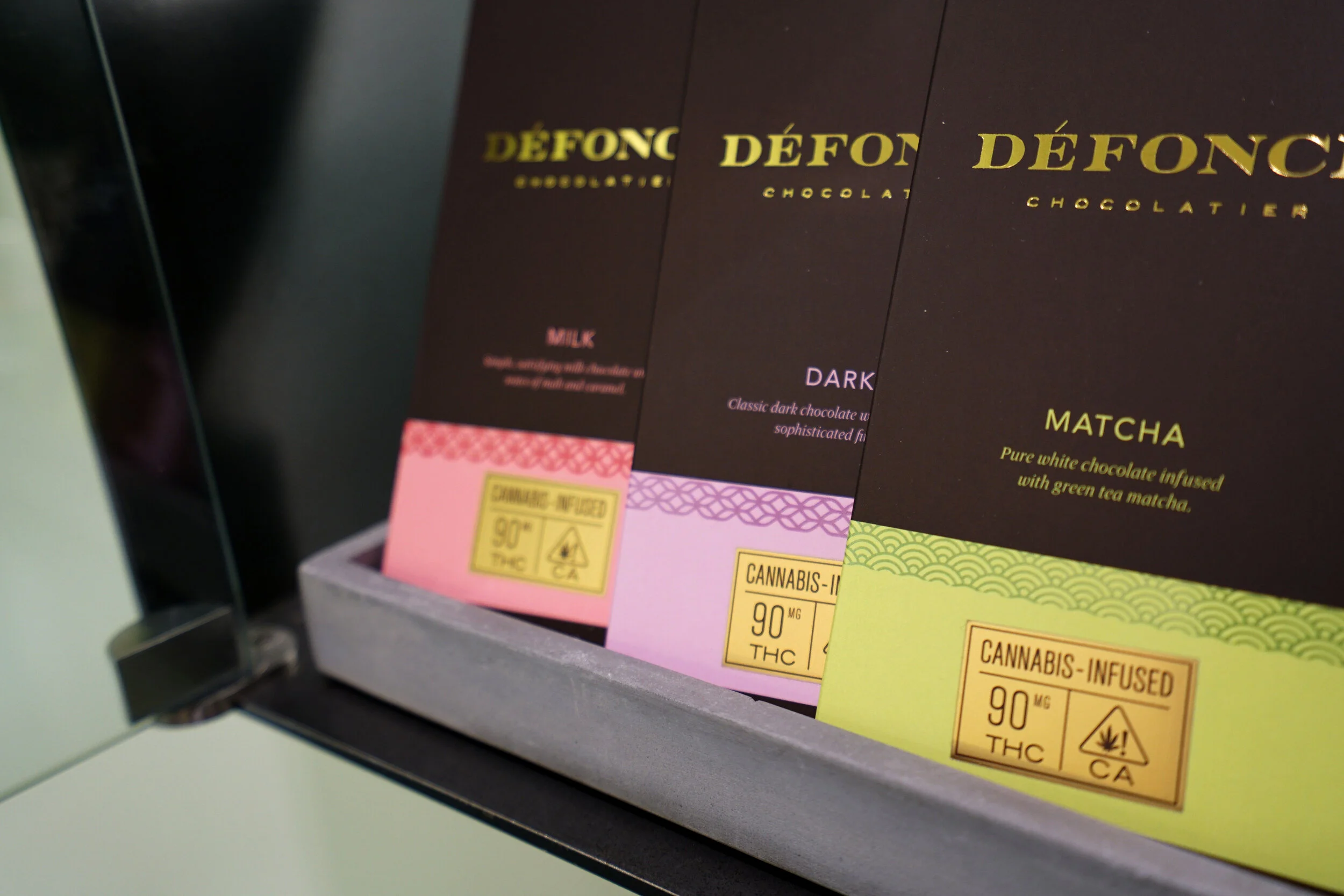
Menu Photography
Size: 640 x 640 px
Mode: RGB / 16 Bit Channel
Resolution: 300 DPI
Output: JPEG


Flower
• Correct White Balance, Saturation, Brightness, Contrast, and Sharpness
• Combine package (top left) and flower (right) shot
• Background must be pure white (hex code: #ffffff)


Cartridge
• Correct White Balance, Saturation, Brightness, Contrast, and Sharpness
• Combine package (left) and cartridge (right) shot
• Background must be pure white (hex code: #ffffff)

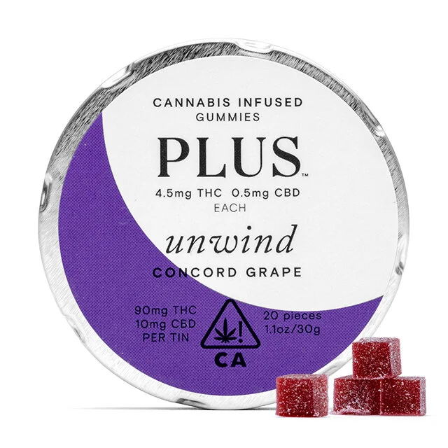
Edibles
• Correct White Balance, Saturation, Brightness, Contrast, and Sharpness
• Combine package (center) and product (lower right) shot
• Background must be pure white (hex code: #ffffff)


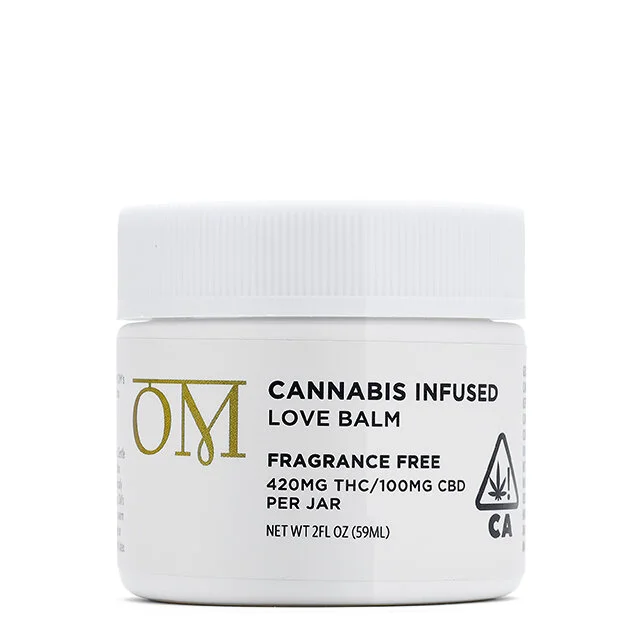
Extract
• Correct White Balance, Saturation, Brightness, Contrast, and Sharpness
• Combine package (top left) and jar (right) shot
• Background must be pure white (hex code: #ffffff)


Pills
• Correct White Balance, Saturation, Brightness, Contrast, and Sharpness
• Combine package (center) and pill (lower right) shot
• Background must be pure white (hex code: #ffffff)


Preroll
• Correct White Balance, Saturation, Brightness, Contrast, and Sharpness
• Combine package (center) and preroll (low center) shot
• Background must be pure white (hex code: #ffffff)
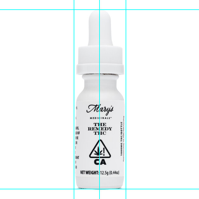

Tincture
• Correct White Balance, Saturation, Brightness, Contrast, and Sharpness
• Center package shot
• Background must be pure white (hex code: #ffffff)

Topical
• Correct White Balance, Saturation, Brightness, Contrast, and Sharpness
• Center package shot
• Background must be pure white (hex code: #ffffff)
Lifestyle Photography
• Warmer color balance
• Ensure main focused is centered and sharp
• Use natural daytime lighting (if applicable)


Visual Merchandising
• Angles Matter - address the visual “entrance” and “exit” before you do anything else.
• Rule of Three - grouping three products together is aesthetically pleasing and provides the potential for making multiple sales on products a shopper would consider buying together.
• Sticker Shock is Real - make sure pricing is consistently on the right side of the product or product set.
• Small Details Make Big Impacts - watch out for unevenly spaced packaging, protruding scotch tape, or packaging with damaging from shipping.
• Environment Matters - pay attention to the space your product sits in by being mindful of small packages in big spaces (or vice versa).
• Showcase The Entirety - take product out of its package when warranted.
• Accessories are Necessary - dress it up but be cautious as the “hero” product should always be the focus.
• Home Brands Get the Last Glimpse - those items we want to up-sell or increase sale margins, showcase them with pride as the last thing one sees.
• Keep it minimal - limit the color scheme and symmetrical design so it doesn’t overwhelm the customer.